

The cover for Queen of Shadows was recently released, both the US and the UK versions, and it made me want to talk about them so let's.
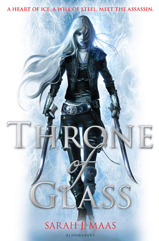
I've always loved the covers of the Throne of Glass series. But before the matching US cover was released for the first book, it looked like this:

It's pretty, right? The background, the font.. it's awesome. But without that dagger, you wouldn't know that girl is supposed to be an assassin. She's too pretty to look bad ass and that fist looks out of place. She looks like Sarah J. Maas, honestly.
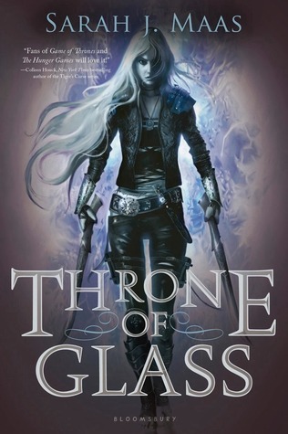
Then the UK edition came out:
...and boom! There's a girl you don't want to cross. You want to buy a book that looks as action-packed as described, you go for that cover. Everybody must have loved this version more (not that I'm surprised) because the sequels came out looking like this:
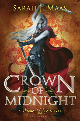
And everyone was like: Are you kidding me? It doesn't match my hardcover copy of the first one and these covers are better so give us another. Lo and behold, here comes the paperback and new hardcover version of Throne of Glass, looking much better than the UK edition.
Good luck buying this edition online. Some stores feature this cover for the book but ends up sending the buyer the one with the pretty face so if you're picky with your covers, I suggest you buy it in store personally unless you're like me, who probably won't ever see this displayed in any bookstore near my place.
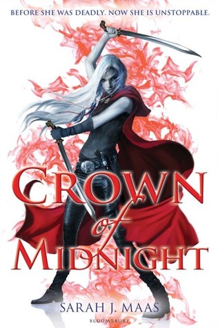
Both looks undeniably awesome but I pick the one on the left.
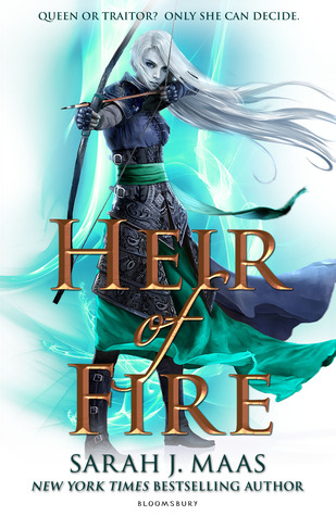
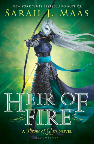
I like the effect of the background of the one on the right. Why the bronze-ish color of the title, though? Kind of ruined the vibe. Also picking left cover.

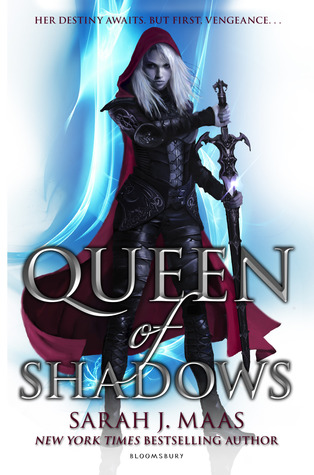
Both! Once again, I like that wicked light-thing going on in the background and I LOVE the typography of the right cover. I also love the left one because it's pink. LOL, not really. But I love that it matches her cape and the typography is also great and most importantly, readable. You can practically read it even from afar unlike the UK version of Throne of Glass and Crown of Midnight that almost blends with the background.
What do you think about these covers?
Love the new covers! They're much cooler looking. The series has become much darker and I think these covers reflect them better.
ReplyDeleteJen at YA Romantics
I've been hoping to read this series but I NEVER see it in local bookstores (and sadly I never buy online). I love the UK covers but I love the Type of the US versions more..
ReplyDeleteczai @ the Blacksheep Project
I'm from the UK so I have the UK covers. I like the UK ones because the back has different colours. But the US versions look great as well, and it's made so much better with the option of getting the hardback (plus Assassin's Blade looks really out of place with it's blue front and side)
ReplyDelete