OLD COVERS:

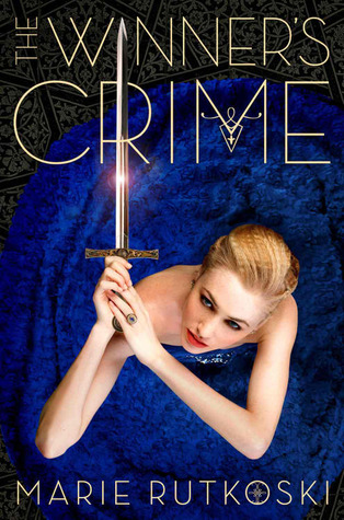
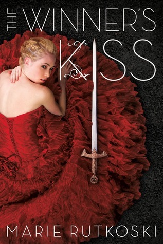
Let's be honest, these covers are gorgeous! It's the first thing I noticed about this book. The dresses are all very pretty but I love the first book's cover the most. I love the unique layout of the title although it doesn't match the second and third books, the way Kestrel's hand curls around the "R", and the dagger she is holding.
NEW COVERS:
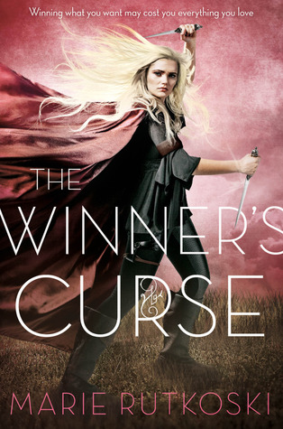
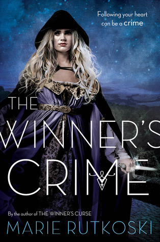

I actually like these covers. It's a bit typical for fantasy books but still pretty cool. BUT. I've read the The Winner's Curse and The Winner's Crime and I say that is not who Kestrel is. The girl on the original covers fit her more. She's kick-ass, yes, but it's her brain that does all the kicking. Well, I can't say for The Winner's Kiss yet but it's a possibility. Hello? The second book's ending? Also, does The Winner's Crime's cover remind you of The Orphan Queen's, too?
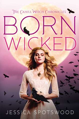
Anyway, this cover change reminds me so much of The Cahill Witch Chronicles. From wicked to, erm, really pretty but not so wicked.

I think The Winner's Kiss - with the original cover - will still be published in hardcover, and all of the series with the new covers, also in hardcover. Which is for the best. This way people can just buy whichever editions they prefer and have them all match :)
What are your thoughts about this change? Do you prefer the new or the original covers?

I'm actually kind of upset that they changed the covers for the Winners series! I've been wanting to check it out but still haven't purchased them, so I may still try to purchase the old ones because I think they're way prettier.
ReplyDeleteKrystianna @ Downright Dystopian
At least they're keeping the old ones. You're right - they're definitely prettier.
Delete