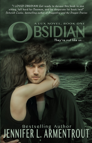
Let's talk about the old cover of the first book, Obsidian, first.
For it's first edition it looks like this:
Daemon looks hot. Katy looks hot. If you ask me, once you see this cover and then start reading the book, there's no denying they are the perfect Daemon and Katy. You won't be able to picture them looking like another person's face. What I didn't like about this cover is that it feels bare. And what's up with the title's design?
Then they changed it to this:
Which I admit looks better than the first. If only they retained Daemon and Katy's previous pic. Daemon looks creepy here (Must be. He's an alien.) but we can't see Katy's face. Oh, well.
The Spanish version looks like this:
It doesn't look like I'm missing something.
And the Italian version..
..is pretty cool and creepy. And has that Twilight Edward-Bella-movie-poster vibe going on.
So the old covers look like this:


 God knows Pepe and Sztella (cover models) are already the face of a bajillion other books but these are my favorites of them - though I am not a big fan of Origin's cover. Great background but flashing Daemon's body did not work. It's ironic.
And the new ones:


 OH! If I didn't put the first and second volume side by side I wouldn't have noticed the girl's face was divided in half (ouch). Honestly, out of these three, the only cover I like is the Beginnings which consists of books 1 and 2 of the Lux series, Obsidian & Onyx. And I'm pretty sure those "bonus material" thingies are not stickers I can easily remove. Gosh, I miss Pepe and Stella already. So the second volume, Consequences, has books 3 and 4. Opposition, the last book in the series, is all in it's lonesome. Is that Pepe on the cover? He looks like a baby I want to pinch.
Bottom line: I prefer the old covers. But I would buy the new one for it's bonus content. Obviously, no choice for Opposition because I'm guessing they wouldn't make a matching cover for the old one. But who knows?
I love this series, by the way!
Then they changed it to this:
Which I admit looks better than the first. If only they retained Daemon and Katy's previous pic. Daemon looks creepy here (Must be. He's an alien.) but we can't see Katy's face. Oh, well.
The Spanish version looks like this:
It doesn't look like I'm missing something.
And the Italian version..
..is pretty cool and creepy. And has that Twilight Edward-Bella-movie-poster vibe going on.
So the old covers look like this:


And the new ones:


Bottom line: I prefer the old covers. But I would buy the new one for it's bonus content. Obviously, no choice for Opposition because I'm guessing they wouldn't make a matching cover for the old one. But who knows?
I love this series, by the way!


In. Complete. Agreement.
ReplyDeleteI really dislike the new covers. Beginnings is okay-ish, but the other two? Eh.
What my real problem is with the makeup on Katy. No. No no no. Katy is the most down-to-earth person ever. She would not wear that much blush.
Okay I'm so confused. I am literally just reading this series. Like I'm reading Onyx right now. Did they combine books and put it into three novels? Is that what the lighter series is (Beginnings, Consequences and Opposition)? I thought those were a different part of the series -like a spin off series. Oh please clear this up for me! :)
ReplyDeleteThey are bind ups the same books, only with different covers and bonus materials included. Beginnings is Obsidian and Onyx combined, Consequences: Opal and Origin, and Opposition is just Opposition ;)
Delete